Background
Student Blue is a health insurance plan for college and university students, offering affordable and comprehensive coverage tailored to their unique needs.
My Role
Lead UX Designer
My Team
1 Designer
8+ Public Website Team Members
Tools
Figma
Adobe Experience Manager (AEM)
Timeline & Status
7 Months, Shipped
Overview
This project focused on redesigning and migrating a website into Adobe Experience Manager (AEM) to create a modern, responsive, and user-friendly experience.
The Goal
- Improved navigation
- Enhanced accessibility
- Optimized performance
- User-focused design
My Process
Discovery, Ideation, Design, Outcome
Impact
3-Month Comparison: Pre-Migration vs. Post-Migration

The Problem
Meet Maya: A Busy College Student
Maya is a 20-year-old junior juggling classes, part-time work, and an active social life. She recently received a letter from her university about enrolling in student health insurance. But when she tried to navigate the Student Blue website, frustration quickly set in.
- Confusing navigation left her unsure of what plans were available.
- The site wasn’t mobile-friendly, making it hard to check details on the go.
- She couldn’t easily find costs, coverage, or enrollment deadlines without digging through walls of text.
- Clicking on links took her to different pages, leaving her lost in a maze of information.
Frustrated, Maya wondered, “Why is something as important as health insurance so hard to figure out?”
The Solution
As part of the UX team, I knew Maya wasn’t alone. Analytics showed high bounce rates and user feedback echoed her pain points. We needed to redesign the experience to make it:
✅ Mobile-friendly for students like Maya who primarily browse on their phones.
✅ Easy to navigate, so she could quickly find information without frustration.
✅ Clear and digestible, breaking down insurance jargon into something understandable.
✅ Seamlessly integrated into AEM, ensuring a scalable and manageable backend.
Discovery
Stakeholder Interviews
I collaborated with stakeholders to define project goals, user needs, and technical constraints, identifying critical features such as mobile responsiveness, and prominent placement of key options (e.g., Waive Coverage). Once I had the requirements, I conducted a content audit of the existing Student Blue site to identify critical information for migration. During this process I partnered with the content author to determine which content to keep, revise or eliminate.
Competitive Analysis

I conducted a competitive analysis by reviewing other health insurance websites designed for students to identify best practices and common pain points. This analysis helped uncover key insights into how students navigate health insurance platforms, their expectations, and the challenges they face.
Key Findings
- Complex language & lack of clarity – Many insurance websites used insurance-heavy language, making it difficult for students to understand their coverage, eligibility, and benefits without additional research.
- Fragmented user journeys - Several websites had disjointed experiences, requiring students to switch between multiple pages or external PDFs to find essential information, leading to frustration and drop-offs.
- Confusing enrollment & billing process – Many platforms lacked clear call-to-action buttons for enrollment, payment, and claims submission, leading to confusion.
These insights guided my design decisions for Student Blue, focusing on a clear, user-friendly experience. I simplified language, improved navigation, optimized for mobile and tablet use, and enhanced accessibility.I conducted a competitive analysis by reviewing other health insurance websites designed for students to identify best practices and common pain points. This analysis helped uncover key insights into how students navigate health insurance platforms, their expectations, and the challenges they face.
Ideation
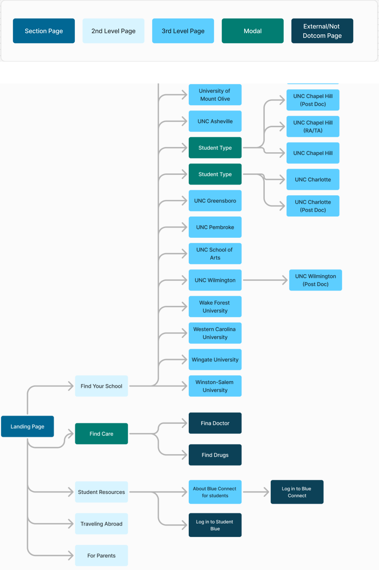
Information Architecture
I developed potential site structures to ensure content was intuitive and easy to navigate. Through close collaboration with stakeholders, I refined the information architecture by balancing business objectives, technical feasibility, and user priorities. This process involved gathering feedback, analyzing user behaviors, and making iterative improvements to optimize the site's structure for clarity and efficiency.

Design
Iterations
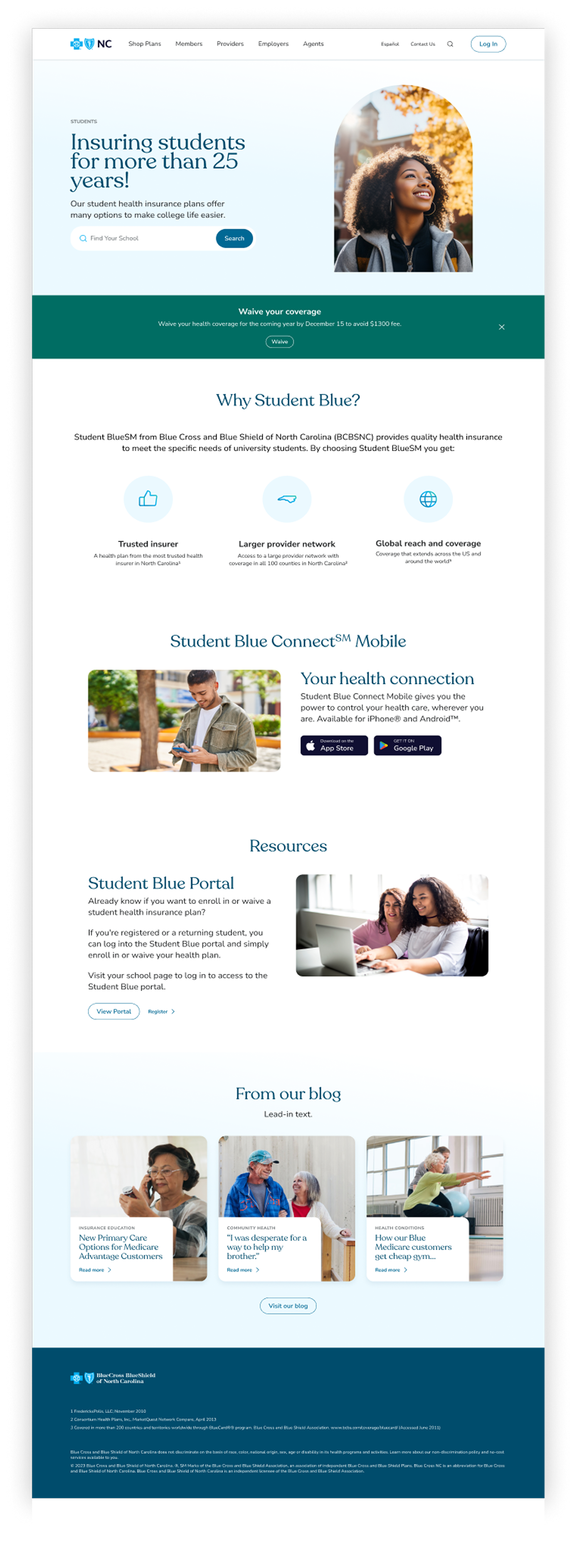
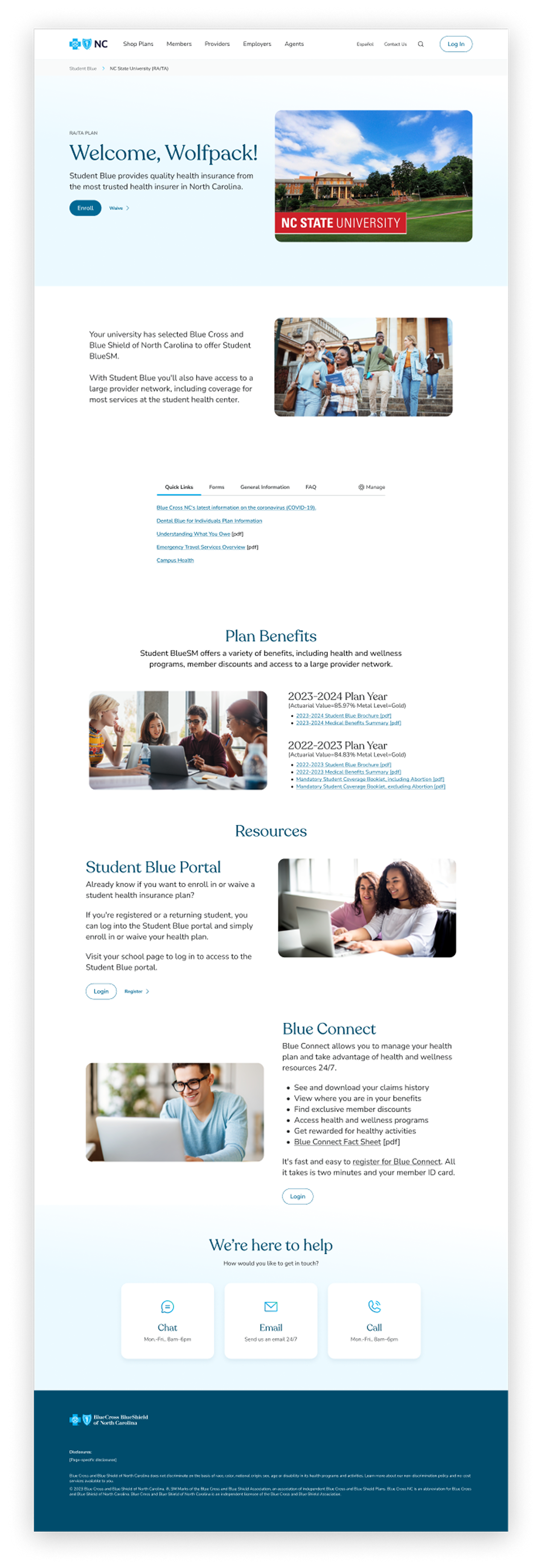
I developed and refined design concepts with a focus on usability, ensuring a clear and accessible experience for students. Throughout the process, I:
- Created multiple design variations to explore different approaches to presenting health insurance information in a student-friendly way.
- Iterated on designs based on stakeholder feedback, refining layouts, content structure, and visual hierarchy.
- Ensured the designs aligned with accessibility best practices, improving readability and ease of navigation.
- Optimized layouts for both desktop and mobile users, making key information easily accessible across devices.
- Worked closely with developers to clarify design intent and ensure accurate implementation.
This iterative process helped create a more intuitive and seamless experience for students navigating their health insurance options.
Key takeaways
The importance of collaboration
Partnering closely with the PubWeb team and stakeholders taught me the value of clear communication and aligning goals early in the process. Effective collaboration was crucial in navigating challenges like CMS limitations and meeting stakeholder expectations.
Adaptability in problem- solving
The CMS constraint around school search functionality required creative thinking to develop a workaround that still met user needs. This experience reinforced the importance of flexibility and exploring alternative solutions when technical limitations arise.
User-centric problem solving
Ensuring the "Waive Coverage" feature was prominent required thoughtful design decisions to address user pain points directly. This reaffirmed that focusing on user needs leads to better outcomes for both users and the business.


